I always think that images that contrast Blue and Yellow work particularly well, like the image of a newly painted warehouse above, even though theory says the Blue – Orange is a true complimentary colour pairing.
Colours in Harmony
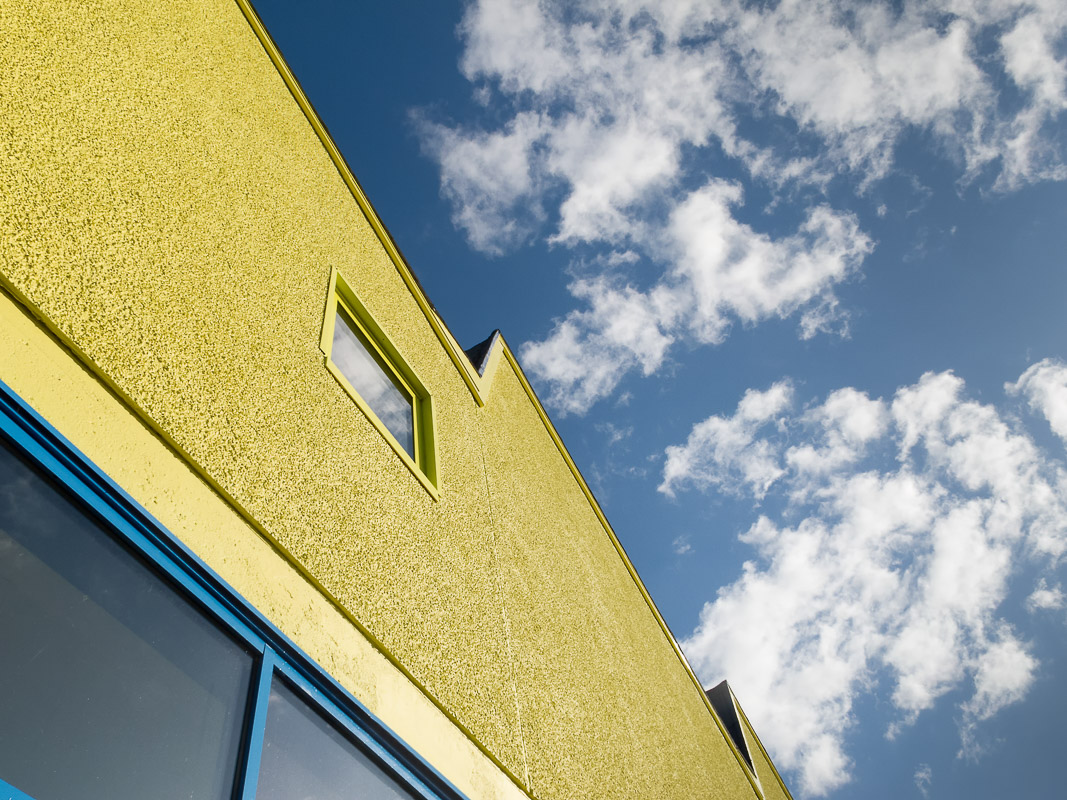
I always think that images that contrast Blue and Yellow work particularly well, like the image of a newly painted warehouse above, even though theory says the Blue – Orange is a true complimentary colour pairing.
Comments are closed.

great shots #friendlyfriday
LikeLiked by 1 person
Thanks, Tanja
LikeLike
Amazing photos and I can see you take your photography seriously. Such vibrant colour! Fantastic to look at!
LikeLiked by 1 person
That’s great! I’m glad you enjoyed seeing them. I say that I’m not really a serious photographer, or it wouldn’t be so much fun.
LikeLike
Keeping the fun in the hobby is the important part.
LikeLiked by 1 person